This is Part 2 of a look inside our rebranding, from IceMilk Aprons to heirloomed.
Our Identity:
With a rebrand, the change is not just in the name; it’s not just a new logo. The culture and core of the brand must be strongly tied to this new brand. Not to mention all the {crazy} tiny details that come along with “changing your name,’ a daunting process for those who have done so personally after getting married. That pales in comparison. From a new logo and website to the nitty gritty details of business licenses, bank accounts, insurance, trademarks and collateral. But hey, it’s a labor of love. And it starts at the very ethos of our roots – our mantra.
Our Mantra:
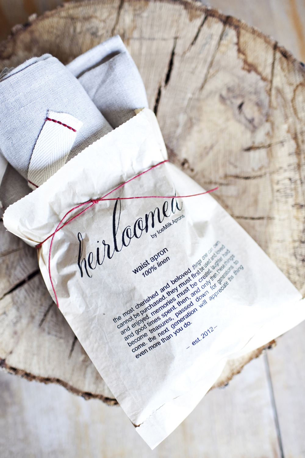
Copywriting is, admittedly not my favorite or strongest suit. It takes me quite a long time {ie: forever} to get the million thoughts in my head whittled down to a concise written form. But our mantra came easily and quickly. It’s honest and true and the core essence of what we are all about as a brand, from a design standpoint, and for the future….
The most cherished and beloved things one can own cannot be purchased. They must first be used and loved and enjoyed. Memories must be created, laughter had and good times spent. And only then, these things become treasures, passed down for generations to come. The next generation will appreciate this “thing” even more than you do.
We cannot MAKE an heirloom. The very definition itself proves we cannot …
” a family possession handed down from generation to generation. “
It’s what we strive to become and it’s the core of every design detail and decision we make. Aspirational? Yes. Attainable, I sure hope so.
Our Logo + Mark:
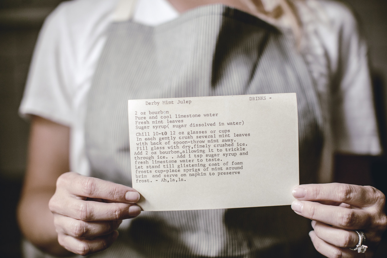
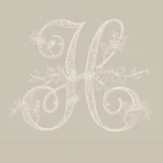
I decided to stick with the same logo we used when we originally launched this concept as a collection. I originally chose the font because it so reminded me of fine handwriting that is so rare today. From the recipe cards of my great grandmother, written with real ink, showing personality, sometimes error, and a commitment of time and skill.
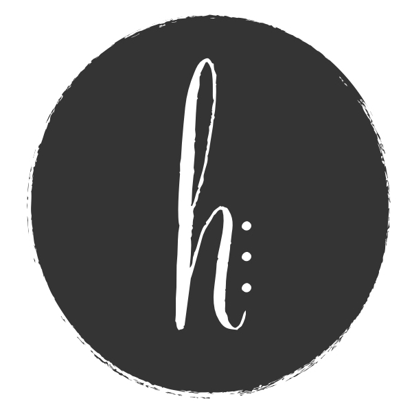
For those who are also tasked with having to love yet actually USE a logo, we created a signature “mark” to compliment our brand identity, making it a little easier to be present in social icons and such. The “h” comes directly from our main logo, with a rough hewn circle giving nod to the past, present and future in our design. The three dots represent three generations of family.
Our Tagline:
Our tagline is rather simple, yet encompassing of the mission. It speaks to design, which is at the heart of all we do. It gives nod to the historical aspect of our roots, while including a family and future appeal.
goods inspired by the past, for generations to enjoy.
I know you’ll continue to see these identity elements alive and in use as we continue to roll out the pieces of our brand.

